The new font I am going to use for the Unconsumable Global Luxury Dispersion project is called Being Human.
I consider a font to be an active part of a text, or more precisely the apparatus and context through which a text is created, visualised and read. A font can also bring to the fore the heterogeneous, even incongruous ways in which concepts and perspectives are (re)presented. With this in mind I have reconfigured its intended action by exploiting the particular way font software operates on source texts and its visualisation on screen and in print. The font I designed creates messy hybrid texts, it visualises and distributes more than intended. I will describe below how this works.
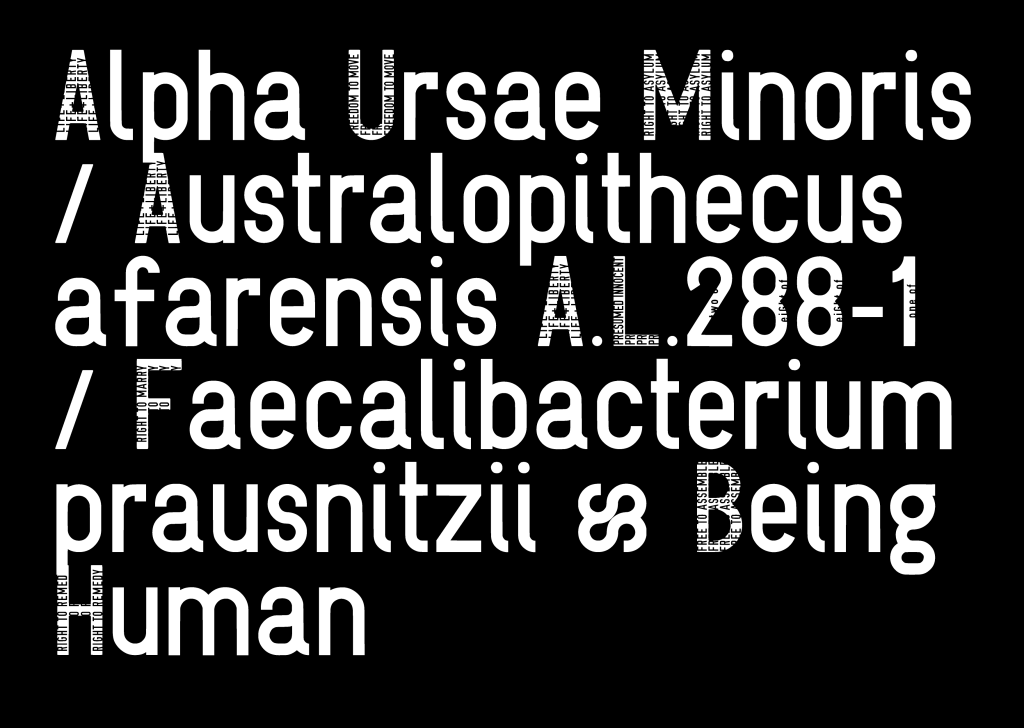
This font is designed with a particular quirk. As an “Open Type” or “True Type” font it works like any other font on a Mac or Windows computer. But, I have inserted words within the individual capitals. Words which are only readable by us, humans, and not by the computers which use the font, because the included words are only part of the graphic layer. A text file on your computer registers only the ASCII numbers of the letter in combination with layout info, such as a particular font name. To put it differently, the words I included within the letters only appear onscreen, while for the computer it is only a line that creates the graphic. The idea to use the separation between the software layer and the graphic layer is based on an idea to change the letters on an old-fashioned typewriter. You press the key for ‘A’ and you get ‘whatever is designed as letter A’. When I discovered that in principle font software still works this way it opened up new ways for me to disperse my work symbiotically.
What I call a symbiotic font is then a font that creates a text which merges a source text with the words included within the font
What I call a symbiotic font is then a font that creates a text which merges a source text with the words/text included within the font glyphs. You could say that both texts live alongside each other or share the same space, but it depends on how the text is visualised if you can read both. For example, the reader might not be aware of it if you use it in normal size (for example 12 points). Only if you use it in large sizes (for example 48 points) the included words become readable within the capitals.
So which words did I include within the capitals? The words I included relate to the human rights and freedoms as they are formulated in the Universal Declaration of Human Rights 1948. See http://www.un.org/en/universal-declaration-human-rights/index.html for more information. Human rights are inalienable from every human being. That is, they can not be taken or given away. They are part of us. They define us as human beings. The Being Human font merges the Universal Declaration of Human Rights symbiotically with every text. If you use this font your text will include a mini version of the human rights and they will get distributed alongside it.
I felt compelled to create this font because the precarious state of the human rights in the world. After its declaration nearly 70 years ago the human rights situation seems to be going backwards instead of making progress. My government and your government are very unlikely to improve these rights as they were declared almost 70 years ago. It is down to us to make this happen: use, disperse and promote your human rights with every sentence you write.
Download link: Being Human Font File
To use the font, download the Being_Human.ttf (fontfile) and place it in your computer’s font folder.
I have a few fonts available at the Open Font Library. Other fonts are SymLogiDIN, a similar font I created in 2012 with different text inside and it has a couple of styles. Putintin is a font that mashes up cyrillic and latin language. Have a look, it is an amazing resource for fonts with usually a SIL Open Font Licence. https://fontlibrary.org/en/member/vvvr
Font Example PDF: being-human-normal-human-waterfall


You must be logged in to post a comment.